Coastal Collective Co.

one room challenge

Coastal Kitchen Makeover: Things To Consider When Choosing a Roman Shade

Home Blog Posts, Interiors, KitchenAnneke McConnell

It is amazing how ONE single change can impact the look of a space.  The function is the same, but the style and look is what makes the room "you" and feel pulled together with other design elements.  I'm happy for my recent experience working with Blindster to share our kitchen window update today!

Let's back up a bit first though.  Recently, I decided to tackle our kitchen for the One Room Challenge, and am SO in love with the results so far!! We painted the cabinets white, added brass hardware, got the cupboards organized, and pulled it together with a new rug, curtains, desk area, etc.  You can see the process over the weeks in the following blog posts.

Week 1 / Week 2Week 3Week 4 / Week 5 / The REVEAL

At the end of the challenge, we were still waiting on our lighting and window treatment to arrive, and now that they have, I NEED to update you on the changes! It looks so good if I do say so myself!!!

Just to review, here is the BEFORE when our home was a vacation rental.

FOCUS on the window area above the sink.

Here are just a few thoughts on the design process and why I chose what I did:

  1. I love, love LOVE natural shades.....anything bamboo and beauty and I swoon.  There was something in me saying that they just were NOT the right fit for the kitchen.
  2. One of my main goals after painting the cabinets white was to creating either a focal point with the window or something that would flow seamlessly and give the kitchen a larger feel.  
  3. I usually lean toward inside mount shades, but from previous experience I knew I wanted ALL the light possible without a shade or valance covering the top portion of the window when it was fully open. (see below)
  4. Also, there was an awkward space ABOVE the window and our ceilings are low, under 8 feet high (which was also a challenge when selecting our island lighting) >>>>> SO, choosing an OUTSIDE MOUNT WAS KEY to creating a visually higher ceiling AND letting in the most light possible.
  5. Because this window is right above our sink, I already dealt with the frustration of pulling a string that seemed to always be in the way and I opted to go with a cordless roman shade.
  6. The light sea blue roman shade brought some softness to the room with the fabric and color versus a hard surface/texture of a bamboo shade.

Below is a photo from our previous home showing you what I mean in #3.


So there you have it!  That's how I went about choosing our window treatment, and yes, Blindster was FANTASTIC the entire time to make sure I was going to order something that I loved!


Below you can see when I was popping the plastic parts into the bottom backside of the shade.  This allows us to easily pull the shade up and down with the cordless mechanism.


Β 

We are so happy with how they turned out!

When they arrived, they had a bit more of a green hue to them than I thought they would, but I love them just as much.  The texture of the fabric is amazing, and the lining is great quality.

Here is EXACTLY what I ordered if you're wondering.

Β 

Yup. Wilmington Water did not disappoint!!  Of course I had to get our little maltipoo Copper in a shot. ;-)  And yes.....he desperately needs an appointment with the groomer, because I give up! 

He often comes and lays on the rug next to my feet while I'm cleaning the kitchen from dinner.  You can't tell from here, but there is a bit of a view of the water from the kitchen sink.

Β 

Because the shades are cordless, it's nice that it comes with a clear plastic part that slips easily on and off the bottom of the shade.....not so easily that it detached when you're using it, but easy enough to take off and clean.  The fabric on the shade stays nice and clean this way. #winning

I love adding custom shades to homes because they really fit the space perfectly.  Even as an outside mount, I measured these so that they would fit with just enough space on the sides to add a little margin room and a couple inches below the ceiling to add height without going ALL the way to the ceiling.

I'm happy it looks so beautiful and next up will hopefully be the faucet!

I hope you have found this design post helpful - if so, please pin it and share!

***This is not a sponsored post, however the shades were provided by Blindster, and all opinions are my own.

Β 

xo,

Anneke

Follow along the day to day on instagram at:

@annekemcconnell

@coastalcollectivestyle

@coastalinteriors

Follow along on Facebook
Β 

Β 

Kitchen Progress: The Finishing Touches

Home Blog Posts, Kitchen, InteriorsAnneke McConnell

Wow. Only one week left until the full reveals for the One Room Challenge and I am admittedly feeling a "little" bummed, but not stressed.  Things are happening slower than I'd like, but I think that's just life. I have to make a choice to be at peace that I'm keeping my priorities in line.  :-) If you're just joining, you can see the first post and vision HERE.  And here is the before when our house was a vacation rental.


Our lighting will most likely arrive today or tomorrow and I CAN'T WAIT! I feel like it is going to make such a statement while providing the much need function of more light.

Β 

We chose the Hinkley Fulton Bronze Island Pendant Light (shown above) from Lamps Plus.  I'm thankful for the opportunity to work with them, and while this is not a sponsored post, they did work with us to provide lighting for our kitchen.  Not just that, but when I was struggling with a few options and dimensions, they were so very helpful in giving advice on the right fit.   They are known for legit great customer service like that as I've heard from others time and time again.

It really was quite the dilemma finding the perfect light because we are dealing with wanting the most number of bulbs/amount of light possible, yet have low 7.5' high ceilings, PLUS the higher full bar height.  We did not want to rewire and work with what we already had. We needed a lighting option that dealt with ALL of those factors, not to mention while adding character AND creating a visually streamlined look.  I can't wait to see this installed and share next week!

Last week I talked about how the husband and I talked about and agreed on herringbone tile.  I am SO happy about this!!! As a family in full-fledged hunting season (deer and elk), he has been gone every weekend for the past month, so this part of the project won't be rushed.  We'll hopefully have the window trimmed out and the tile installed before Thanksgiving though, so I hope you'll come back to see how that makes a difference from next week's reveal (which I think is spectacular in and of itself btw!).

As for the nook next to the kitchen cabinets, it is coming along with my favorite rustic desk and some blue coral artwork.  From drapes to chairs, to the kitchen rug, it feels like it's coming together nicely with the finishing touches.   I'd love to paint or wallpaper that part of the wall where this desk is, but it won't look quite right until the tile is installed with the pencil molding in place (this gives the installed tile that finished edge/look).

Β 

Because it was kind of a "down week", I directed some energy into working on lightening our fireplace stone.  Our kitchen, dining and living are all open in one small area, so although I was focusing specifically on the kitchen portion for this challenge, it only makes sense to work on the other areas when I can so they are compliment each other.  It has been a bit tedious, but easy to whitewash the flagstone. See the difference already! This was after the first layer of graywashing the stone before whitewashing it to make it even lighter, and I am painting the dark wood mantle the same white paint as the kitchen.

I love to "shop our home" occasionally and move things around for a different look and feel.  Because we are in the fall/winter season here at our beach house and not walking on the beach as much, I opted to use this rug of ours below (found on eBay!).  Since it is a smaller "scatter" type of rug, it has moved often over the past year, but I think will work perfectly in our kitchen in front of the sink.  I love the kilim look and will put it on top of our memory foam mat to keep things comfortable and not slipping around.  These don't look so pretty by themselves, but they make ALL the difference in comfort, so throwing a pretty rug over the top works great.

Oh! And Copper says HI! ;-)

Β 

Thanks again for joining us on our journey!

Β 

xo,

Anneke

Follow along on instagram at:

@coastalcollectiveco

@coastalcollectivestyle

@coastalinteriors

Follow along on Facebook

Kitchen Makeover Progress and Herringbone Tile Backsplash

Kitchen, InteriorsAnneke McConnell

Hello friends! Be sure to follow along on Instagram and Pinterest for all the behind the scenes, not to mention my new FAVE app Periscope!!

Today I have a brief kitchen makeover update for ya.

*****Update: here is the entire series

Week 1: The Vision and Before Photos

Week 2: Painting the Cabinets

Week 3: Purging, Storage and Organization Solutions in the Kitchen

Week 4: Herringbone Tile

Week 5: Evaluating Progress

Week 6: Kitchen Reveal

Β 

Β 

So kitchen news = not so exciting BUT exciting at the same time.  How so???  Well, not much happened on moving forward this week.  It kind of felt like a waiting week and discussing some final decisions about what we really would like to do.

The lighting and window treatments have yet to arrive and be installed, but the backsplash has been up for debate.  Here is a recent progress shot to give you an idea of the backsplash area.

Β 

There isn't a ton of square footage that we are working with, but it isn't exactly a small project like just painting or what I was thinking >>>>> to add some horizontal planking and extend the white color from the cabinets down.

I'm SUPER happy to say that after talking with my husband, we have decided to move forward with installing a herringbone tile backsplash.  Heck to the YES!!! #happydance

Once I began searching for more options, it became clear that this would look beautiful with our current countertops and add a little bit of pattern and interest.  For months I thought that when we did go ahead with adding tile, we would go with a classic white subway tile, but I absolutely LOVE the look of the herringbone pattern!

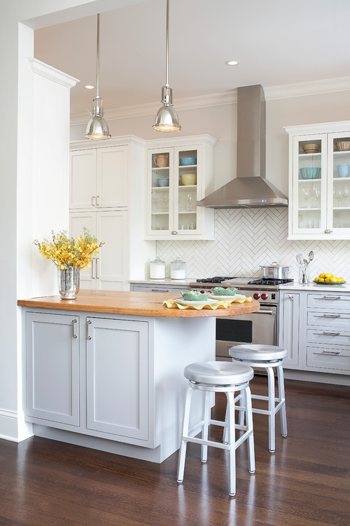
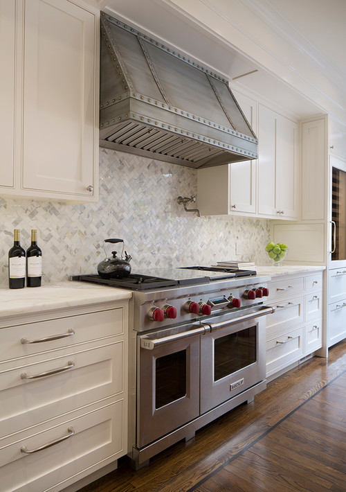
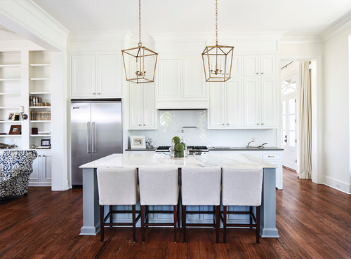
Here are just a handful of kitchens I found inspiring for our beach house kitchen.  Most of these have a similar cabinet style to our home and touches of gold.

I'm honestly not sure if this part of our kitchen makeover will happen before the reveals of the One Room Challenge, and I'd rather not rush the decision, but here are a few options I have in mind.  I'm open to your thoughts on these too!! I think the biggest decision will be the size of tiles that we go with.


Β 

I love all of these options and think they are so beautiful.  I'm personally leaning toward the 1 x 3 sizing in Calcutta Gold but the smaller mother of pearl is so pretty too - what do you think???  I am considering the amount of direct light we get from the kitchen windows as well as an easy to clean option.

Overall, the kitchen is coming along nicely and I can't wait to share the entire makeover!! Thanks so much for following along!


xo,

Anneke

Follow along on instagram at:

@coastalcollectiveco

@coastalcollectivestyle

@coastalinteriors

Follow along on Facebook

Want to learn how to refinish your own furniture? Click HERE.


One Room Challenge: Storage and Organization in the Kitchen

Home Blog Posts, Interiors, KitchenAnneke McConnell

Welcome if you are hopping over for the One Room Challenge This was a bit of a slow week in the makeover, but I tackled some pretty key tasks in regards to organizing the cabinets and drawers and making things more functional for everyday. 

You can see the before photos vision in Week 1 and the detailed ups and downs of painting of the cabinets in Week 2 - that was a BIG change!!

At this point, I'm still waiting on the delivery of some key pieces we'll need to install like lighting, window treatments, etc., and debating on the backsplash area.  We're not ready to take on a tiling project, but I'm not sure I want to just paint. Decisions, decision!  Anyhow, it was a good week to tackle the functional side of things.

And look! The hardware got installed!! I'm so happy about this - it adds so much sparkle and warmth to the kitchen.  Installing hardware is actually a slight fear of mine - like "fear of screwing it up and ruining the cabinets" kind of fear.  Even though they make these cool installation guides, our hardware is 6.5" and 7.5" roughly and much longer than the guide.  I ended up making my own "jig" from stiff cardboard and it worked beautifully! #happydance

IMG_0880.JPG

When it comes to the storage and organization side of things in the kitchen, I think most people want to tackle it head on, get it all "perfect" and live in organized bliss.  What I've found over the years is that it is truly a process.  Yup.  Needs change, which means the need for various kinds of storage and organization change as well.  Here are a few of the items we currently use and the process I went through to better serve our family's current needs.

Β 

1.  Purge Excessive Kitchen Items.

Even after downsizing from our previous home, it had been a couple years since I'd had a heart to heart on what we really needed and were actually using.  When space is tight, it especially forces you to get rid of items you have multiples of.

I pulled out a few laundry baskets and began separating items into Keep, Maybe, and Purge baskets.  You can use cardboard boxes or whatever else of course.  I realized I had way more serving utensils than I needed (even when it came to entertaining and having extras), baking dishes, serving platters, etc.  Purging was honestly such a relief!  It's tedious and not so fun, but worth it in the end.  When you don't feel like your cabinets are coming out at you when you open them, it creates a calm - at least for me.  

Β 

2. Evaluate the Placement of Items.

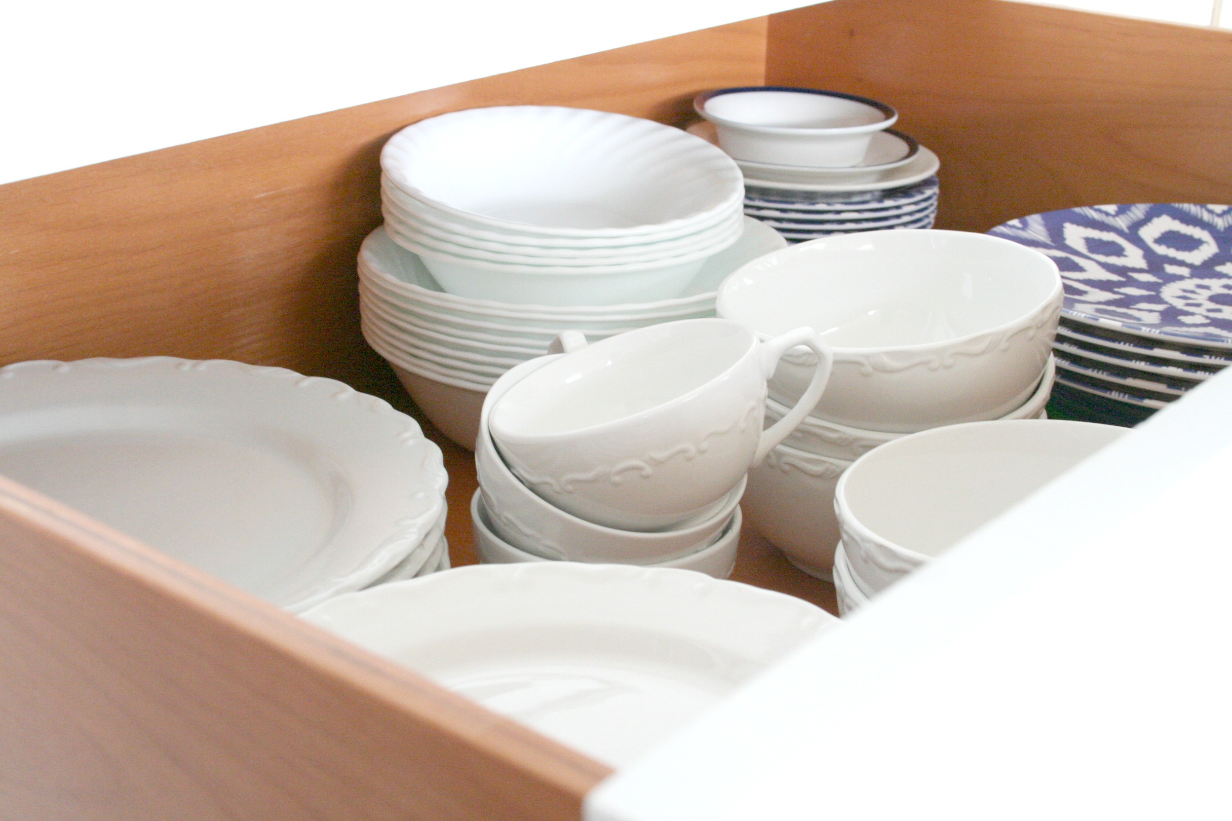
It has already been a time saver and stress relief just moving items around to different areas that simply make more sense.  We moved a few items down that make it easier for our kids to reach.  A few examples are that everyday dishes and bowls got moved to a lower drawer instead of an upper cabinet.  We also moved down a handful of drinking glasses for them to have easy access to.

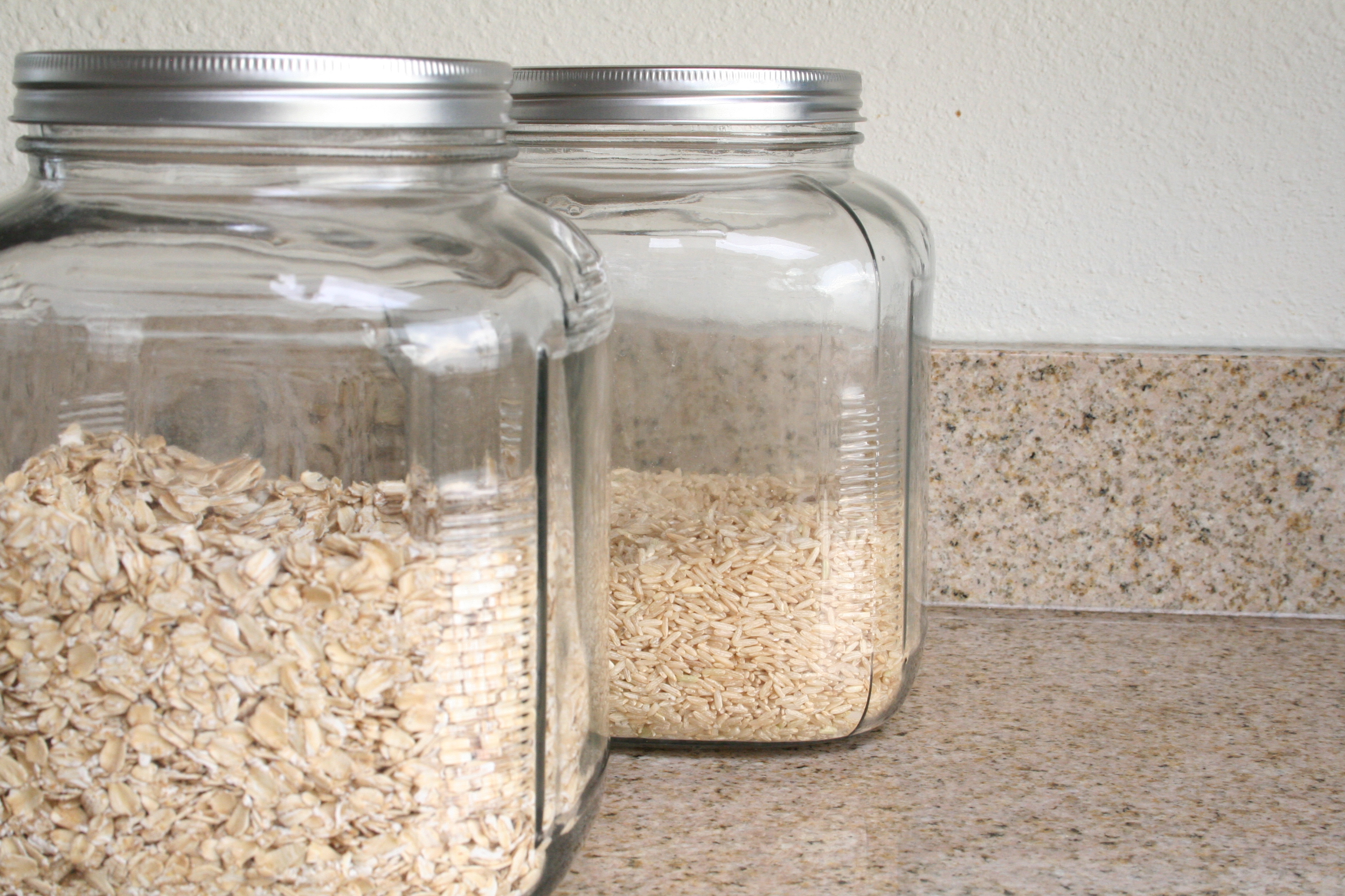
 Our toaster got moved from a high upper cabinet to a lower cabinets along with our glass storage containers with oatmeal, rice, hot cocoa, etc. These got moved off of our counter space and I couldn't be happier - clear counters in a smaller home really make everything feel so much more tidy and clean!  I had the room to do this, because I went through Step 1 and wasn't storing as much bakeware in this cabinet.

IMG_0871.JPG

3. Group Like Items and Consider "Flow of Traffic".

It only makes sense to put things where there is the shortest "reach" or distance when actually using them.  The coffee maker is near the faucet for water and cups, beans, etc. are all within reach.  This is especially important when you have a larger kitchen.  Less used items are typically higher and on the outer edges so to speak.  When you don't have a pantry like us, you may have reserves stored in a cabinet with a few of each item in a closer to reach work zone.

There is a cabinet next to our dishwasher that is a bit out of the work zone and was the perfect place for party type place settings, vases, etc.  The sun beats down in this area through the back window and skylights at different times of the day so anything in this area has to be able to withstand heat.  I'd LOVE to put a small storage cabinet here for extra pantry storage, but this reality nixes that idea instantly. 

round gold dining chargers / natural round dining chargers / white serving platter

Β 

Overall, I'm pretty happy with how things are coming together.  I feel like things are looking more of our Pacific Northwest coastal loving style and we're gaining more organization, more function, and less stress.  That's a win in my book!  If you're looking for some storage type of containers for your kitchen, below are a few others that we have as well as some recommendations.  I almost forgot to mention I love using open weave baskets like the ones below for storing potatoes and onions!  As for this next week, I think we are going to tackle the desk/dining nook area, but here's a peek at the latest furniture makeover!! I can't WAIT to share more!!! >>> ***UPDATE: Makeover can be seen HERE. To get on the waitlist for the next online furniture painting class, learn more HERE!


xo,

Anneke

Β 

Follow along on instagram at:

@coastalcollectiveco

@coastalcollectivestyle

@coastalinteriors

Follow along on Facebook

Want to learn how to refinish your own furniture? Click HERE.